


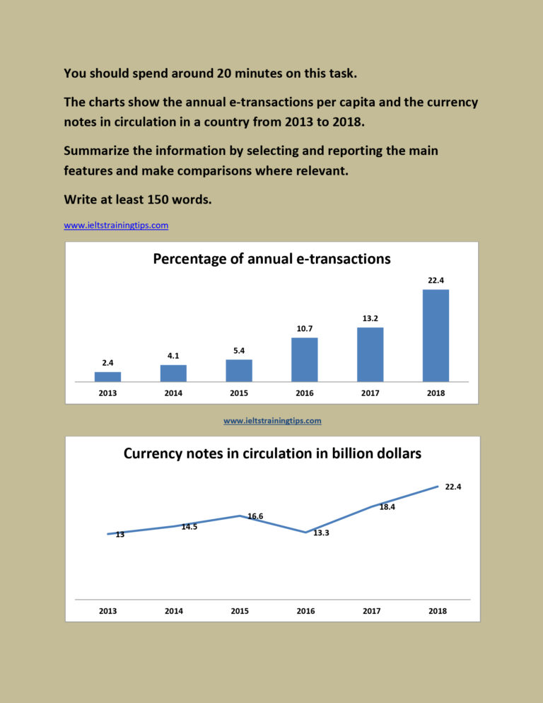
The proportion of yearly e-transactions and the circulated currency notes in a country between 2013 and 2018 are depicted in the charts. At a glance, an upward trend is seen both in the percentage of e-transactions and in the currency circulation over this period. It is also clear that...
You should spend about 20 minutes on this task. The table below shows expenditures of four car companies on advertising in the UK in 2002. Summarise the information by selecting and reporting the main features, and make comparisons where relevant. Write at least 150 words. ...
MODEL ANSWER>>> Data regarding the gross number of vehicle registration in Australia divided by five categories in 2010, 2012 and 2014 is depicted in the given table. At a glance, it is clear that there was an increase in this number over the period, with a higher registration rate...
You should spend about 20 minutes on this task. Write at least 150 words. MODEL ANSWER>>> A statistical comparison of the number of native speakers of six prominent global languages and their additional number of speakers is tabulated in...
You should spend about 20 minutes on this task. The bar charts below provide information about percentages of students who are proficient in a foreign language in different countries. Summarise the information by selecting and reporting the main features, and make comparisons where relevant. You should write at least 150 words. ...
You should spend about 20 minutes on this task. The diagram shows the movement of carbon on and around the atmosphere Summarise the information by selecting and reporting the main features, and make comparisons where relevant. Write at least 150 words. MODEL ANSWER>>> The ways in which carbon moves...
You should spend about 20 minutes on this task. The pie charts compare ways of accessing the news in Canada and Australia. Summarise the information by selecting and reporting the main features, and make comparisons where relevant. Write at least 150 words. MODEL ANSWER>>> Data regarding the popularity of...