MODEL ANSWER:
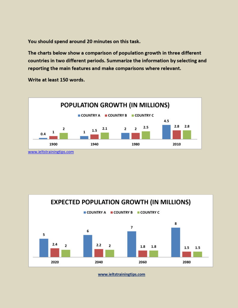
An illustration of population growth in three distinct countries from 1900 to 2010 and it’s projections from 2020 till 2080 is depicted in the bar charts.
As per the first graph ,it is noticeable that there was a considerable population growth in three countries during the first time period. In 1900, in country C, it was the highest at 2 million, which was almost double than country B and five-fold higher than country A. Though it had a clear surge in 1940, it remained almost the same ratio. However, after two decades, it got almost leveled in country A and B, whereas it stood high in country C (2.5 million). In 2010, country A crossed 4.5 million growth in population, while others remained at 2.8 million.
Turning to the second graph,in country A,the population growth is expected to rise steadily to 8 million in 2080 from 5 million in 2020, whereas other two countries anticipate a decline from an average 2.2 million to 1.5 million.
Overall,it is clear that, the growth of population in these countries inclined throughout the first time period, but it is expected to decline in future, except in country A, which projects an inverse trend.
Word count: 183