


The graph and table below show the average monthly temperatures and the average number of hours of sunshine per year in three major cities. Summarize the information by selecting and reporting the main features and make comparisons where relevant.
MODEL ANSWER:
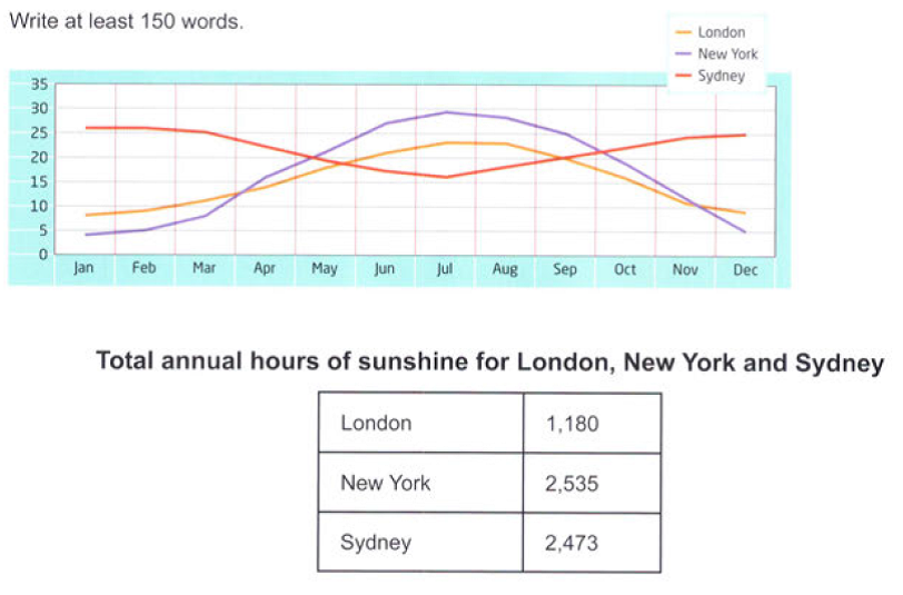
Information on the average temperatures and annual hours of sunshine in London, New York, and Sydney is portrayed in the given charts.
At a glance, Sydney enjoys the warmest overall climate, with an average monthly temperature of 20 to 25’C in the first four and the last three months of a year. However, New York has the hottest summer, which peaks to 29’C by mid July from the lowest of less than 5’C in January. Though the temperature pattern of both New York and London appears to be very similar, in mid July, when London records the maximum temperature, it falls around 6’C less than the other city. Thereafter, it starts dipping to its lowest of 8’C by next January. The middle of July is also important for Sydney, when its temperature slips to its lowest of 16’C and from this point, the mercury in the city starts climbing back.
Turning to the total duration of sunshine, both New York and Sydney have a similar duration of around 2,500 hours which is far more than London’s (1180).
Overall, it is clear from the charts that London is by far the coldest city and has the fewest hours of sunshine in a year.