


You should spend around 20 minutes on this task.
The pie charts show information regarding world population in 1900 and 2000. Summarize the information by selecting and reporting the main features and make comparisons where relevant.
Write at least 150 words.
MODEL ANSWER:
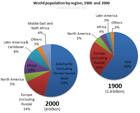
A comparison of the global demographic pattern by region between 1900 and 2000 is elucidated in the given charts.
As shown in the charts, Asia remained at the top as the most populated region in both the years. However, a decline of 6% is visible in its global share, which was 60% in 1900. A similar decline is seen in Europe’s share (including Russia), which stood behind Asia and this was 11% from a quarter of the total global population.
On the other hand, of the regions which showed a surge in this proportion, Latin America was exceptional, with a hike of more than double (from 3 to 8%) compared to its own contribution to the world population in 1900. Africa too exhibited a very similar pattern( from 4.5 to 10%). It should be noted that a new region, comprising of the Middle East and North Africa had a global population share of 6% in 2000. It is also interesting to note that the aggregate world population had an exponential growth from 1.6 to 6 billion over this period.
Overall, it is clear that the regional contributions to the world population had visible fluctuations except in the case of North America and others over the given period.
Word count:192