 MODEL ANSWER:
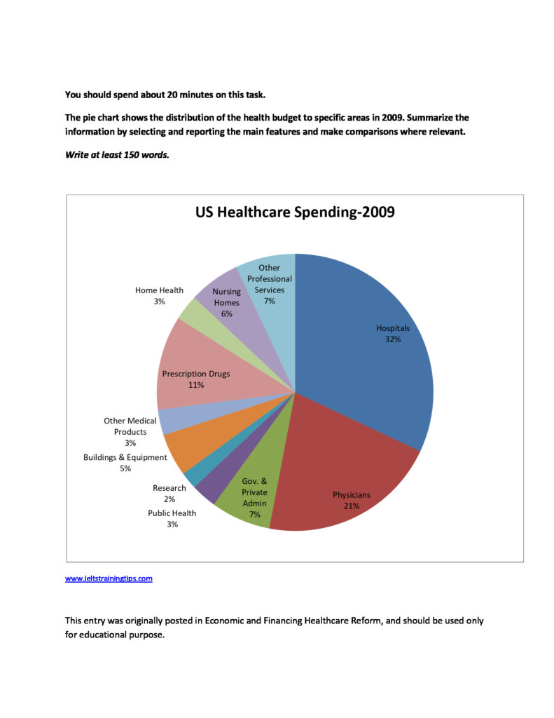
The differences in the share of healthcare spending in the USA in the year 2009 are depicted in the given pie chart.
It is clear from the chart that the lion share of the health budget was reserved for the functioning of hospitals. This was nearly a third of the total health budget. The next major allocation of the fund was channeled to the service area of physicians (21%). The financial aid to the area of prescription drugs was comparatively lesser than these two, when it was 20% less than the hospital’s share and around 10% less than the physician’s.
The US healthcare spending in 2009 was very limited to the rest of the areas. When both government and private administration and other professional services shared an equal proportion of the budget, it was a per cent less for the nursing homes. The distribution of funds to the rest of the areas (research, public health, home health, other medical products, buildings and equipment) ranged from 2 to 5%.
Overall, it is clear that when more than half of the healthcare spending in the US in the particular year was allocated to both hospitals and physicians, this was very limited to the rest of the areas.
(Word count: 187)
NOTE: It is recommended to compare the figures in a pie chart with fractions, for example, a third, half, a quarter….instead of just comparing those as they are. However, figures should not be excluded from the answer, as they are vital in the task.