


You should spend about 20 minutes on this task.
The chart below shows the movement of people from rural to urban areas in three countries and predictions for future years.
Summarize the information by selecting and reporting the main features, and make comparisons where relevant.
Write at least 150 words.
MODEL ANSWER>>>
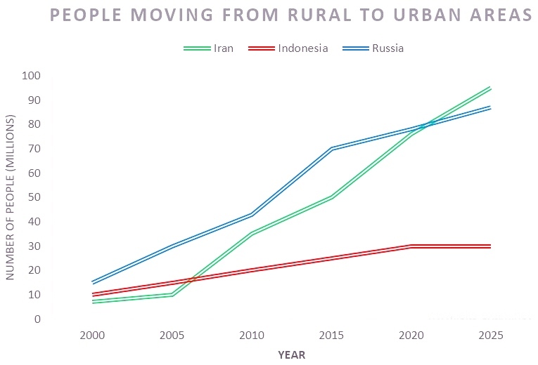
A statistical comparison of urban migration in three different countries from 2000 till present and its projection till 2025 is depicted in the solid line graph.
Overall, except in case of the prediction, the trend of movement in all three countries is seen upwards.
As per the chart, in 2000, the urban migration was more in Russia than in Indonesia and Iran. This was nearly 15 million, when compared to 10 and 8 million respectively in the other two. When a uniform growth is seen in the urban shift of Indonesian population since then, till present to around 30 million, there were fluctuations in the pattern of movement in other two countries.
In Russia, there was an increase of 25 million migrants between 2000 and 2010, but the growth leapt in the next five years, by almost 30 million, to hit 70 million mark in 2015. Iranians, on the other side, exhibited a sharper growth in this migration between 2005 and 2010, compared to other time frames till present and this was from 10 to approximately 35 million.The status of migration at present is the same in Russia and Iran and this is recorded at 80 million.
The estimated migration volume is more in Iran than in Russia by 2025, and the projected disparity is almost 10 million. An arrest is expected in the Indonesian urban migration from now, till 2015 (at around 30 million).