MODEL ANSWER:
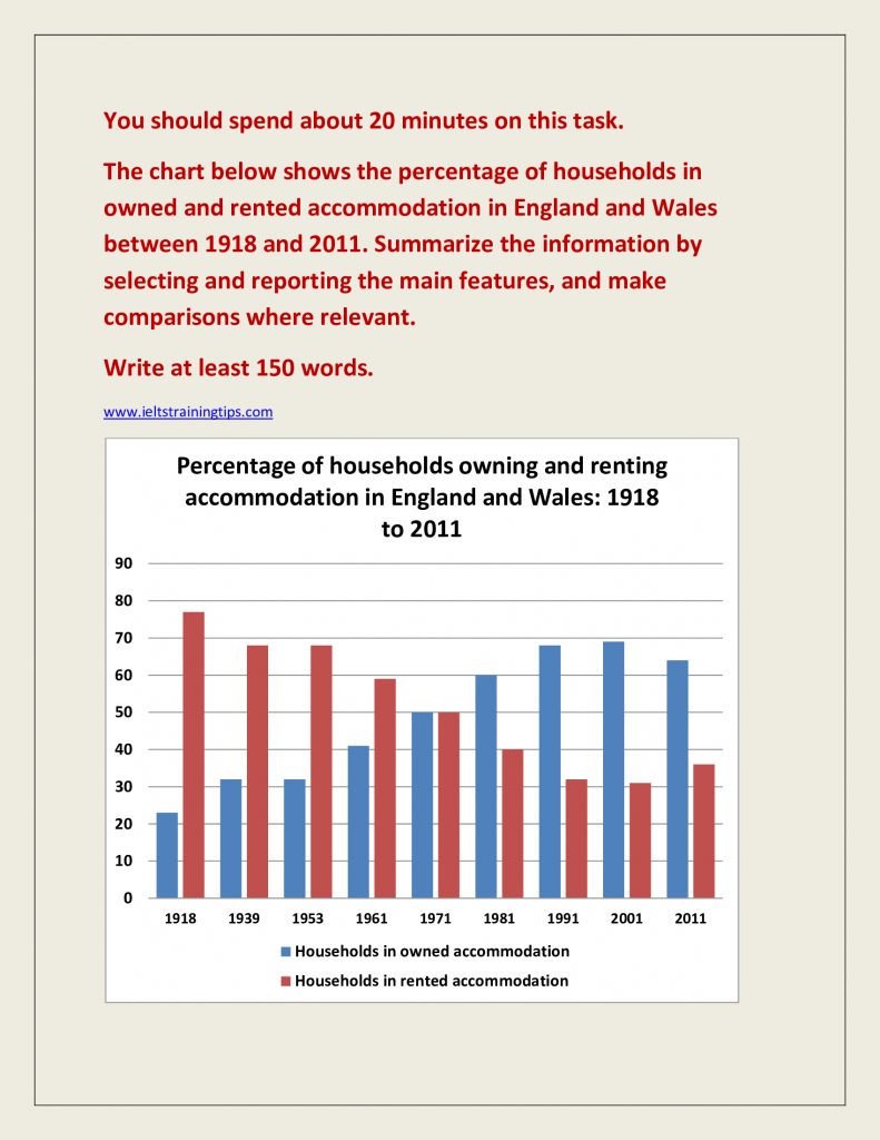
The rate of households who had own accommodation and rented facilities in England and Wales from 1918 to 2011 is charted in a systematic way in the given bar graph.
At a glance, one can see that both these types of accommodation were almost inversely proportional to each other.
As per the chart, the proportion of households in England and Wales who had their own houses is seen increasing during the period, with an exception in 1939, 1953 and 2011. This proportion stood at around 23 in 1918, grew by almost 10 in 1939 and is seen leveled at the same rate till 1953. Then it is seen inclining steadily to reach to a peak of almost 70 by 2001. However, after a decade, it dropped by almost 5.
On the other hand, the rate of households who lived in rented accommodation is generally seen falling throughout the period. In 1918, it stood at around 77, fell by almost 10 in 1939 and stood at the same level till 1953. Then it started declining further at regular intervals till 2001, when the rate hit a nadir of 30, but it went up by 5 after a decade.It is interesting to note that the rates are seen equal in 1951(50%).
Word count: 187