


You should spend about 20 minutes on this task.
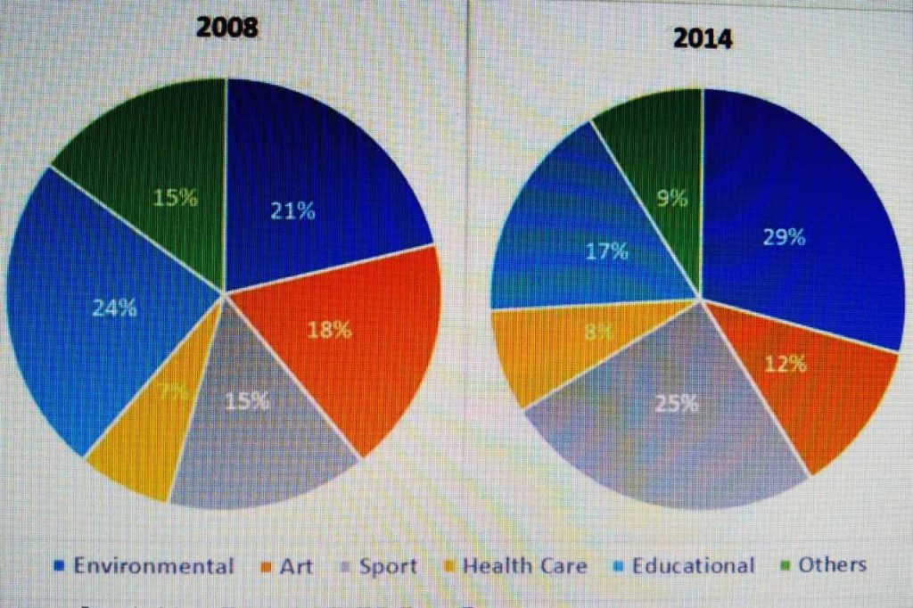
The charts below show the percentage of volunteers by organisations in 2008 and 2014.
Summarise the information by selecting and reporting the main features, and make comparisons where relevant.
Write at least 150 words.
MODEL ANSWER>>>
Information on how the proportion of volunteers in different sectors varied in 2014 compared to that in 2008 is depicted in the given pie charts.
Overall, it is clear that except in the healthcare sector, wide variations are seen in the volunteer’s proportion.
As per the first chart, in 2008, most volunteers were there in the educational sector, which comprised just under a quarter of the total (24%). However, in 2014, the environmental sector occupied the first position with 29% of the total volunteers.
The highest growth in the rate of volunteers is seen in the sports sector, when it grew by 10 in 2014 from just 15 in 2008.Growth was also seen in the sector of environment (from 21% to 29%).
However, there occurred a decline in the percentage of volunteers in educational, art and other sectors. In the educational sector the decline was by 7%, whereas in the rest two, it was by 6% each.
Healthcare sector had the least number of volunteers in both the years (7- 8%).
Word count: 156