You should spend about 20 minutes on this task.
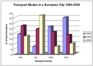
The following bar chart shows the different modes of transport used to travel to and from work in one European city in 1960, 1980 and 2000.
Summarize the information by selecting and reporting the main features and make comparisons where relevant.
Write at least 150 words.

MODEL ANSWER:
A statistical comparison on the pattern of travel to and from work in a European city in 1960, 1980 and 2000 is drawn in the given bar chart.
As per the chart, the transport modes saw visible fluctuations during the period. In 1960, most people in the city traveled on foot, which accounted for nearly 35%. The rate of travel on bike was almost 10 less than those who walked. When around 17% traveled by bus, just 5% commuted on automobiles.
The pattern changed after two decades (1980), when most travelers preferred bus (over 25%). The proportion of people who used car leapt to 23 from a mere 5%, whereas the year saw a decline in the bike riders and walkers (5 and 17% respectively).
By 2000, most traveled by car, which accounted for over 35%. A decline is seen in the rate of people who used other forms of transportation. The worst fall was in the proportion of bike travelers (from 20 to nearly 5).
Overall, it is clear that unlike other transport modes, the preference to cars inclined significantly over the period.
Word count: 166