


You should spend about 20 minutes on this task.
The graph below gives information about changes in the birth and death rates in New Zealand between 1901 and 2101.
Summarise the information by selecting and reporting the main features, and make comparisons where relevant.
Write at least 150 words.
MODEL ANSWER:
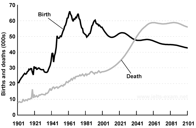
A clear cut comparison between the birth and death rates per 1000 people in New Zealand from 1901 till now and its projection till 2101 is depicted in the given line graph.
Overall, it is clear that though the birth rate was higher in New Zealand till now, in future, the trend is set to reverse.
It is clear from the chart that in 1901, the birth rate stood higher than the death rate, and this was just over 20 per 1000 population, when compared to fewer than 10 in case of deaths. By around 1965, the birth rate rose to over 65, which was the highest ever recorded in the given period. Then after the rate is seen declining irregularly, and at present, it is just over 50 per 1000 people. On the other hand, the death rate showed almost a gradual growth to reach around 30, by this time.
Turning to the estimation of deaths, it is expected to rise further and would overtake the rate of births by 2041. It would be the highest in both 2061 and 2081 (almost 60 per 1000) and is projected to settle at around 55 by the end of the period. At the same time, the birth rate is anticipated to slip further and would ultimately settle by about 45.