


MODEL ANSWER:
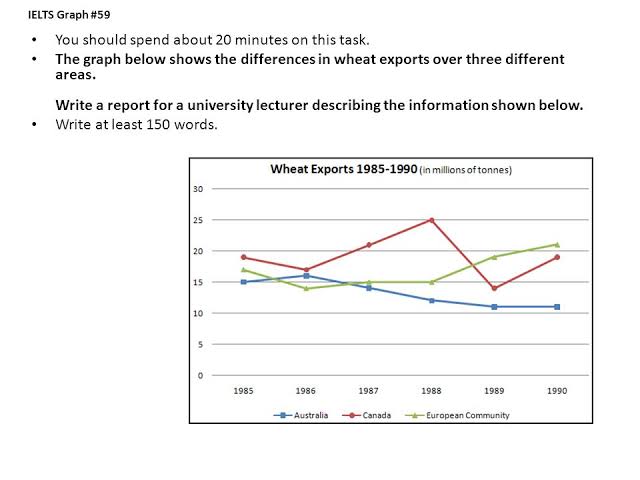
Variations in the exportation of wheat over three distinct areas from 1985 to 1990 are represented in the given line graph.
In 1985, the aggregate quantity of exports in these areas was about 50 million tonnes, of which the major share was Canada’s (nearly 18 million tonnes). Of the rest, the wheat exports in Australia was on the lower side, which accounted for exactly 15 million tonnes. Both the countries’ volume converged at almost 17 million in 1986, which then started diverging, and in 1988, the disparity between their exports reached its maximum (approximately 11 million tonnes). At this point, the export index of Canada exhibited the highest among these areas (25 million tonnes).
Until 1988, in all three years, except in 1985, the export volume of the European community did not go over 15 million tonnes. However, it grew surpassing the others’ and crossed the 20 million mark just before 1990. There was a plunge in the exports of Canada between 1988 and 1999, but by 1990, it grew back by 5 million. Australia’s export index kept on declining till 1990, but did not fall below the 10 million mark.
Overall, it is clear that the volume wheat exports fluctuated widely in these areas except in the initial years.
Word count: 187
Image courtesy: IELTS-Share.com