


You should spend about 20 minutes on this task.
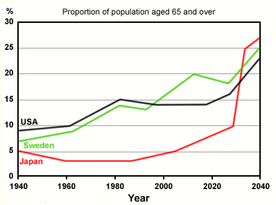
The graph below shows the proportion of the population aged 65 and over between 1940 and 2040 in three different countries.
Summarise the information by selecting and reporting the main features, and make comparisons where relevant.
Write at least 150 words
MODEL ANSWER>>.
The distribution of aged population (over 65) in three distinct countries from 1940 till now, and its projection till 2040 is depicted in the given line graph.
Overall, it is clear that the aged population in the USA and Sweden was increasing until now, but the estimation is different, with a hike in Japan’s old age population.
As per the chart, the proportion of 65 and above was the highest in the USA (at around 9% of the total population) in 1940. This was almost double than that of Japan’s and 2 more than Sweden’s. After 40 years, this rose in the USA and Sweden to 15 and 14 respectively. However, in japan, it is seen more or less declining to almost 3 till 1985.
The percentage of aged over 65 in Sweden overtook America’s after 1995 to record a spike of 20 by 2015. In japan, this climbed slowly from 3 to almost 7 at present (2020). The present figure in the USA is just under 15%.
Despite some fluctuations in between, the old age population in Sweden and the USA is estimated to rise, and by 2040, it would hit 25% and 23% respectively. Interestingly, the Japanese aged population is projected to soar by 2030 to hit a zenith of over 27% by 2040.