


MODEL ANSWER:
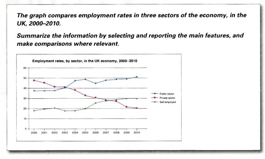
Information on employment engagement, divided by sectors in the UK between 2000 and 2010 is drawn in the given bar graph.
At a glance, it is clear that when the rate of employment in the private sector experienced a decline all through the period, the proportion of people in the UK in the public sector and who took up their own jobs inclined over this decade.
In 2000, around 50% of the people were engaged in private sector jobs. This was almost 10 more than the rate of public sector employees and 30% more than those who could find their own jobs. By 2003, the proportion of public sector and the private sector employees became equal (40%), whereas the rate of self-employed in the UK stood under 18%. Despite a fall in 2006, the rate of public sector employees climbed and crossed 50 by the end of 2010. The rate of self-employed too showed an increasing trend until it reached nearly 30 by the end of the period. The decline, which was visible in the rate of private sector employees continued throughout the years till it reached the nadir of 20 % by 2010.
Word count:177