


You should spend about 20 minutes on this task.
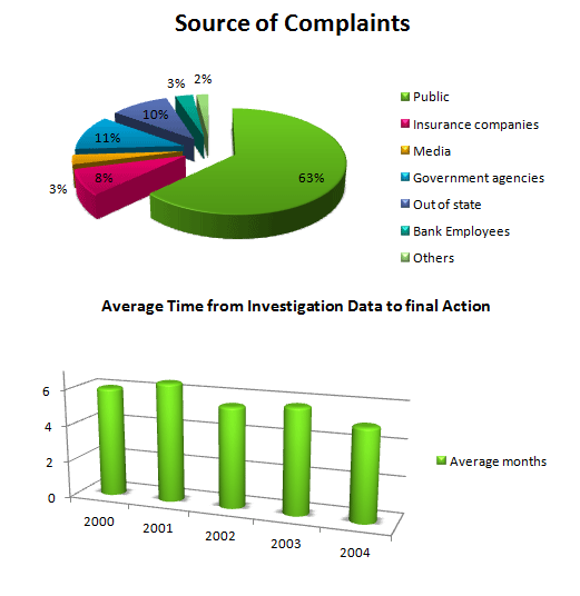
The graphs indicate the source of complaints about the bank of America and the amount of time it took to have the complaints resolved.
Summarise the information by selecting and report in the main features, and make comparisons where relevant.
Write at least 150 words.
MODEL ANSWER:
The pie chart illustrates share of complaints the bank of America receive, while the second chart gives information on the average time duration it took to resolve the complaints between 2000 and 2004.
In general, by far the highest rate of complaints against the bank is from the public. It took almost less than half a year to investigate the data and resolve the issues over the given period (2000-2004).
As per the pie- chart, most complaints are from the public, and this account for almost 63%. Of the remaining 37%, 8 to 11% are from government agencies, out-of-state agencies, and insurance companies. Government agencies register around 11% of the total complaints, while the rates of complaints registered by the other two are 10 and 8 respectively. Media and bank employee make up and equal figure, 3% in the chart.
The average time the bank took from investigation of the data (complaints) till completing its resolving during 2000 and 2004 was about 4 to 6 months. The maximum time it took for this was in 2001(6 months), and the minimum was in 2004 (just over 4 months).
Word count: 169