


You should spend about 20 minutes on this task.
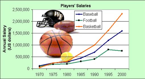
The line graph below shows information about the salary of three sports received per annum from 1970 to 2000.
Summarize the information by selecting and discussing the main features and make comparisons where relevant.
Write at least 150 words.
MODEL ANSWER:
A comparison of player’s remuneration in three sports genres calculated on an annual basis from 1970 to 2000 is depicted in the given line graph.
As per the graph, the salary of players from all three categories of sports showed a general increase. In 1970, the yearly salary was recorded at around $100,000 for all these players. There was a slight hike in this by 1980, in which the salary of football players ($250,000) is seen slightly subdued than the other two ($300,000).
However, the next decade saw a diverging pattern in the remuneration of these players. It stood almost at a difference of $300,000 in 1990, with the basketball players enjoying the maximum benefit ($1,000,000).
An exponential growth is seen in the salary of both basketball and baseball players between 1990 and 2000. In case of the former, the hike was almost $2.4 million, whereas the latter registered an increase of $900,000.
Though there was an increase in the salary of football players from 400,000 to 8000,000 between 1990 and 1995, this was seen declining towards the end.
Overall, it is clear that though there was a uniform salary for all these players in the initial years, it showed a wide disparity by the end of the period.