


MODELA ANSWER>>>
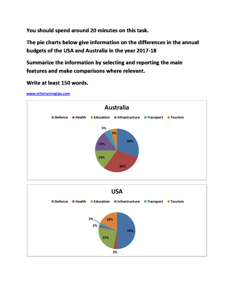
A clear cut comparison of the annual budgets of the USA and Australia in the year 2017-18 is shown in the given pie diagrams.
Overall, it is clear that both budgets are very dissimilar except in case of defense.
As per the charts, the sector of defense is given notable weightage by both countries in the given financial year. In the USA, it was exactly half of its total budget, whereas in Australia, this was less than a third (30% of the total). When Australia gave equal preference to the health sector along with defense, the USA’s proportion was negligible in this field (3%).
In the field of education, the USA allocated more money than Australia did. The share of education in the budget was a quarter in America, which was 10% more than Australia. The next major attention was on tourism in the USA, which came around 18% of the annual budget, whereas in Australia, this was just 5%.
Infrastructure was another area in which Australia concentrated, when it allocated 15% of the budget share, while this was just 2% in the USA. The proportion of budget spending on transport was comparatively less in both countries.
Word count: 189