


You should spend about 20 minutes on this task.
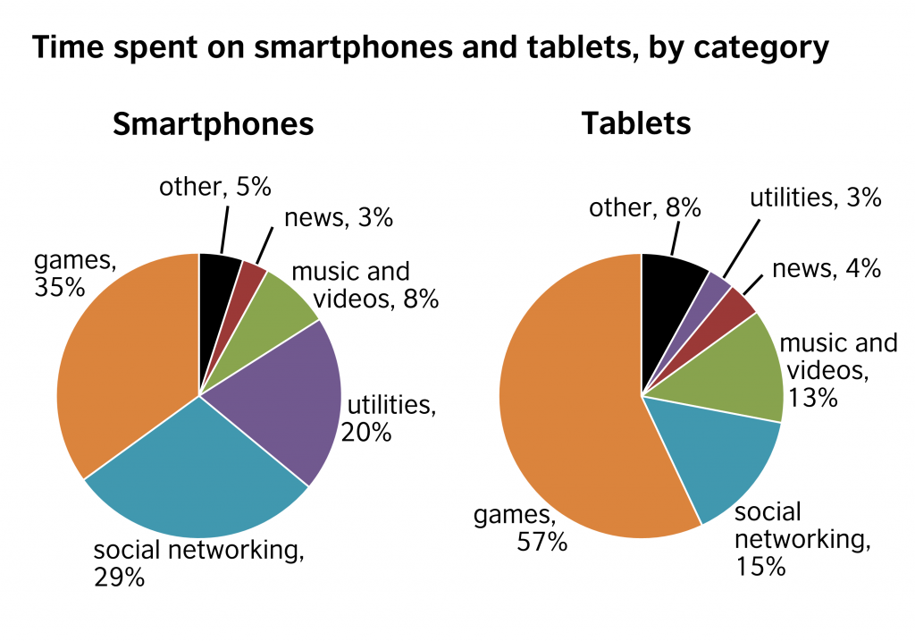
The pie charts below show the data regarding the time people spend on smartphones and tablets, divided by category.
Summarize the information by selecting and reporting the main features and make comparisons where relevant.
Write at least 150 words.
MODEL ANSWER>>>
Information regarding the duration of time which people spend on smartphones when compared to tablets is depicted in the given pie charts.
Overall, it is clear that games and social networking are popular activities on both these gadgets when compared to other uses.
As per the charts, the lion’s share of time is attributed to both games and social networking, and this accounts for almost three-fourth of the total time spent, however, the individual proportions vary. When over a third of the total time spent on smartphones is for playing games, people spend more than half of their time with tablets for doing the same (57%).
However, the time spent on social networking, the next popular activity is more in smartphones, with a percentage difference of 14. When 29% of the total time spent on smartphones is attributed to social networking use, utilities consumed only 20%. Only a mere 3% of the total time spent on smartphones is dedicated to utilities.
When 13% of the time engaged in tablets is for enjoying music and videos, in smartphones, it is just 8%. News is recorded as comparatively the least popular activity in both gadgets.
Word count: 186