


You should spend about 20 minutes on this task.
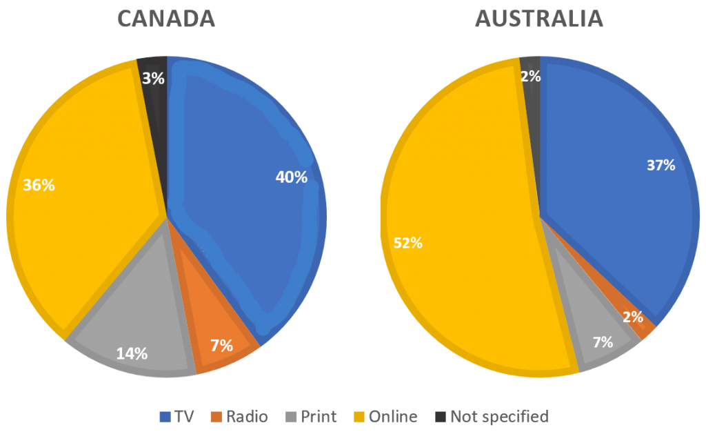
The pie charts compare ways of accessing the news in Canada and Australia.
Summarise the information by selecting and reporting the main features, and make comparisons where relevant.
Write at least 150 words.
MODEL ANSWER>>>
Data regarding the popularity of various news-accessing media in Australia when compared to Canada is depicted in the given pie charts.
Overall, it is clear that when Australia depends more on newer modes of information technology to access news, in Canada traditional modes are still popular.
As per the charts, the lion’s share of the population prefers to obtain online news, and this crosses the half-way mark (52%). This is about 15% more than those who view TV to access day-to-day information.
In Canada, the situation is almost opposite, when almost two-fifth of the total population depend on TV to gather news. Though there is a sizeable proportion who prefers online news (36%), their rate falls behind the TV viewers.
When there exists over two-fifth of Canadian residents who rely on radio and print media (14% and 7% respectively) for accessing news, this aggregate accounts only under 10% in Australia, with radio playing a greater role (7%).
Word count: 150