MODEL ANSWER:
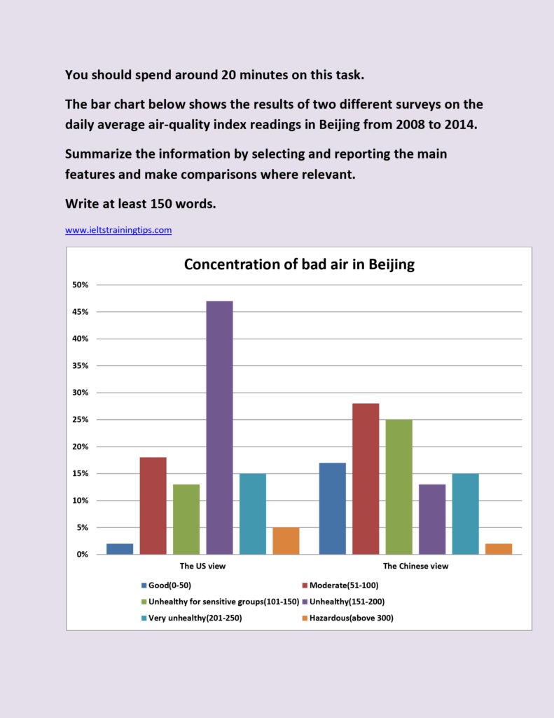
The outcome of two different surveys conducted by the US and China on the concentration of bad air in Beijing over the period from 2008 to 2014 is illustrated in the given bar chart.
As can be seen from the chart, the US view recorded a lower rate in the first three categories of the concentration of bad air in Beijing than in the Chinese view. When the US view stated that, in Beijing, only 2% of the safest level of bad air concentration was present per day in this period, the Chinese study claimed that it was eight times higher. Similarly, in cases of the second (bad air concentration: 51-100) and third category (bad air concentration: 101-150), the Chinese claim was around 10 to 12% higher. Both the studies agreed perfectly on the level of ‘very unhealthy’ category (15%). However, a visible discrepancy is seen between the studies in the rest of the categories, in which the US study revealed that over 45% was the ‘unhealthy air’ (bad air concentration: 151-200) present in the Beijing, whereas this was under 15% as per the Chinese study. Differences exist in the case of the most toxic air concentration too (2-3%), when the US survey projected it more serious.
Overall, it is clear that the Chinese study presented a safer picture about the air quality per day in Beijing over the period.
NOTE: It is recommended to keep the word count under 200.