


You should spend about 20 minutes on this task.
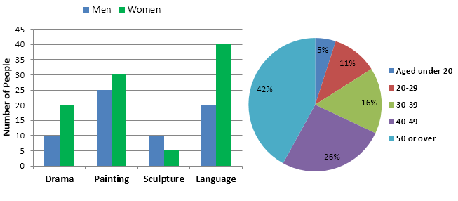
The bar chart below shows the numbers of men and women attending various evening courses at an adult education centre in the year 2009. The pie chart gives information about the ages of these course participants.
Summarise the information by selecting and reporting the main features and making comparisons where relevant.
Write at least 150 words.
MODEL ANSWER>>>
The pictures illustrate the attendance of male and female students to four different evening courses divided by age at an adult education institution in 2009.
It is clear that women participants outnumbered the men in all the courses except in sculpture. It can also be seen that the majority of the students were from the oldest age group (50 or over).
As per the bar graph, in the language class, the number of female students was 40, which was twice as the number of the males. In the painting and drama class, men’s figures accounted for around 25 and 10, which were lower than the women’s (30 and 20 respectively). As for the sculpture class, there were 10 male participants, while the female’s figure was just its half.
It is obvious from the pie-chart that the highest proportion of the course participants were from the senior age group (50 or over), which accounted for over two-fifth of the total. Students from the two middle age groups (40-49 years and 30-39 years old) took the course at 26% and 16% respectively. When 11% of students attended from 20-29 group, the youngest group had the least participation rate (5%).
Word count: 176