The chart below gives information about how families in one country spent their weekly income in 1968 and in 2018.
CAMBRIDGE 17 ACADEMIC WRITING TASK , TEST 3


The chart below gives information about how families in one country spent their weekly income in 1968 and in 2018.
CAMBRIDGE 17 ACADEMIC WRITING TASK , TEST 3
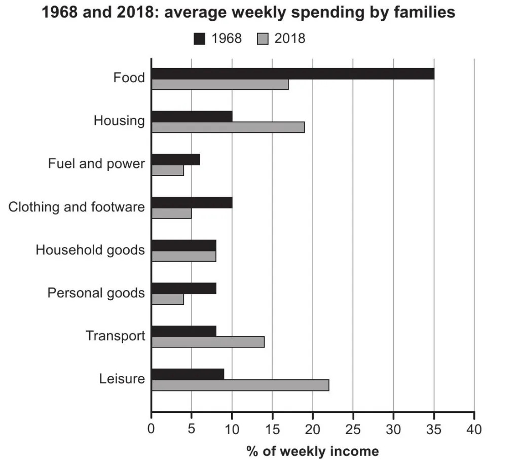
The bar chart shows how an average family’s weekly disbursement on eight different areas in a country was different in 2018 when compared to 1968.
In general, the pattern of spending appears much economical for families on their basic requirements, except in case of housing and transport.
As per the chart, the highest allocation of a family’s weekly budget was on food in 1968. This accounted for 35% of their total weekly income, whereas they had not spent over 10% on any other area. In case of housing, clothing and footwear, an average family spent exactly 10% of their weekly income, while for the rest, the rate of weekly spending stood between 6 and 9.
By 2018, the rate of weekly expenditure on food fell by almost a half from 35%. A similar fall is seen in case of the spending on clothing and footwear, which was to 5% from 10% and in case of personal goods, from 8% to 4%. Around 2-3% decline is also seen in case of the weekly expenditure on fuel and power. On the other hand, the spending rate hiked in case of housing, transport and leisure, and this was by 8%, 5% and 12% respectively. It should be also noted that the spending on household goods remained the same at 8% in both the years.