


You should spend about 20 minutes on this task.
The charts below give information about the diet and general health of two groups of students.
Summarize the information by selecting and reporting the main features, and make comparisons where relevant.
You should write at least 150 words.
MODEL ANSWER>>>
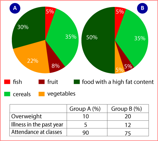
Data regarding the dietary pattern of two groups of students along with their general health and attendance in the past year is illustrated in the given charts.
Overall, it is clear from the charts that the dietary habit of group A was better than that of group B and this had a close relation with the issues they faced including less attendance, illness and overweight.
As per the pie charts, over a third of both groups (35%) consumed cereals, while the rate of those who had fish was just 5. Except these, there existed dissimilarities in their dietary pattern.
While exactly half of group B students preferred fatty foods, it was just 30% in case of the other group.
More students from group A had fruits and vegetables, which accounted for 30%. However, the proportion of those who had these in group B was just 10%.
Turning to the share of students who had health issues, group B had almost double the share when compared to group A. While 10% of group A students were overweight, just 5% suffered illness in the past year. Better attendance percentage was recorded among the first group, which was 90, compared to just 75 in the other group.