You should spend about 20 minutes on this task.
The charts below show the levels of participation in education and science in developing and industrialised countries in 1980 and 1990.
Summarise the information by selecting and reporting the main features and make comparisons where relevant.
Write at least 150 words.
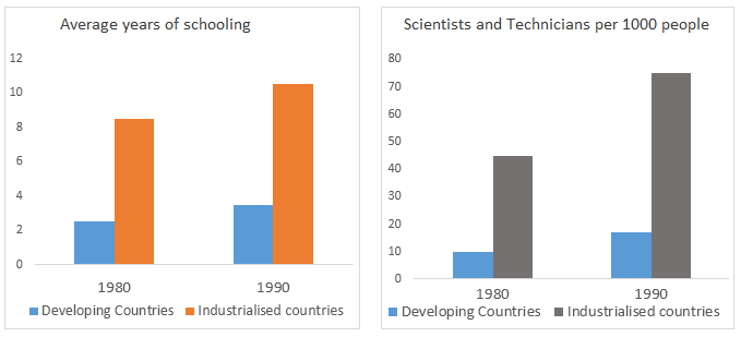
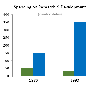
Information on the way which developing countries differed in the participation of education and science when compared to industrialised countries between 1980 and 1990 is depicted in the given bar charts.
Overall, it is clear that in all three areas in which the comparisons are made, industrialised countries far outweighed developing countries.
When assessing the average years of schooling, children in industrialised countries had a far higher average than the children in developing countries. When in 1980, this was two and eight years respectively, after a decade, the duration grew by one year in case of developing countries and two years in case of industrialized countries.
Looking at the number of scientists and technicians these countries produced, developing countries could produce only less than 20 out of every 1000 people in both years, whereas the developed countries could increase the number from 45 in 1980 to 75 in 1990.
In research and development too, the industrialised countries exhibited their dominance. When their spending hiked from $150 million to $350 million, in developing countries it halved from $50 million between 1980 and 1990.