You should spend about 20 minutes on this task.
The given graph shows recycling rates for selected materials. Summarise the information by selecting and reporting the main features and make comparisons where relevant. Write at least 150 words.


You should spend about 20 minutes on this task.
The given graph shows recycling rates for selected materials. Summarise the information by selecting and reporting the main features and make comparisons where relevant. Write at least 150 words.
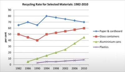
The pattern of recycling of different materials between 1982 and 2010 is depicted in the given line graph.
In general, the rate of recycling went up for all four types of materials, but the pattern of their growth differed significantly.
In 1982, the percentage of paper and cardboard which was recycled was 65%, which was 15% more than the rate of recycled glass containers. After some fluctuations, in 1994, recycling of the former type of materials hit a peak of 80%, which stood 30% more than the latter. From then the trends grew opposite, and by 2010, the rates of recycling of both stood at 70 and 60 respectively. It is also noted that there was a decline in the recycling of both these types of materials in 1990.
The recycling of aluminium cans saw a tremendous growth after it was initiated in 1986. From just under 5% it climbed to 45% by 2010. There occurred a gradual hike of nearly 5% in 2010 from about 3% plastic which was recycled in 1990.
Word count: 153