


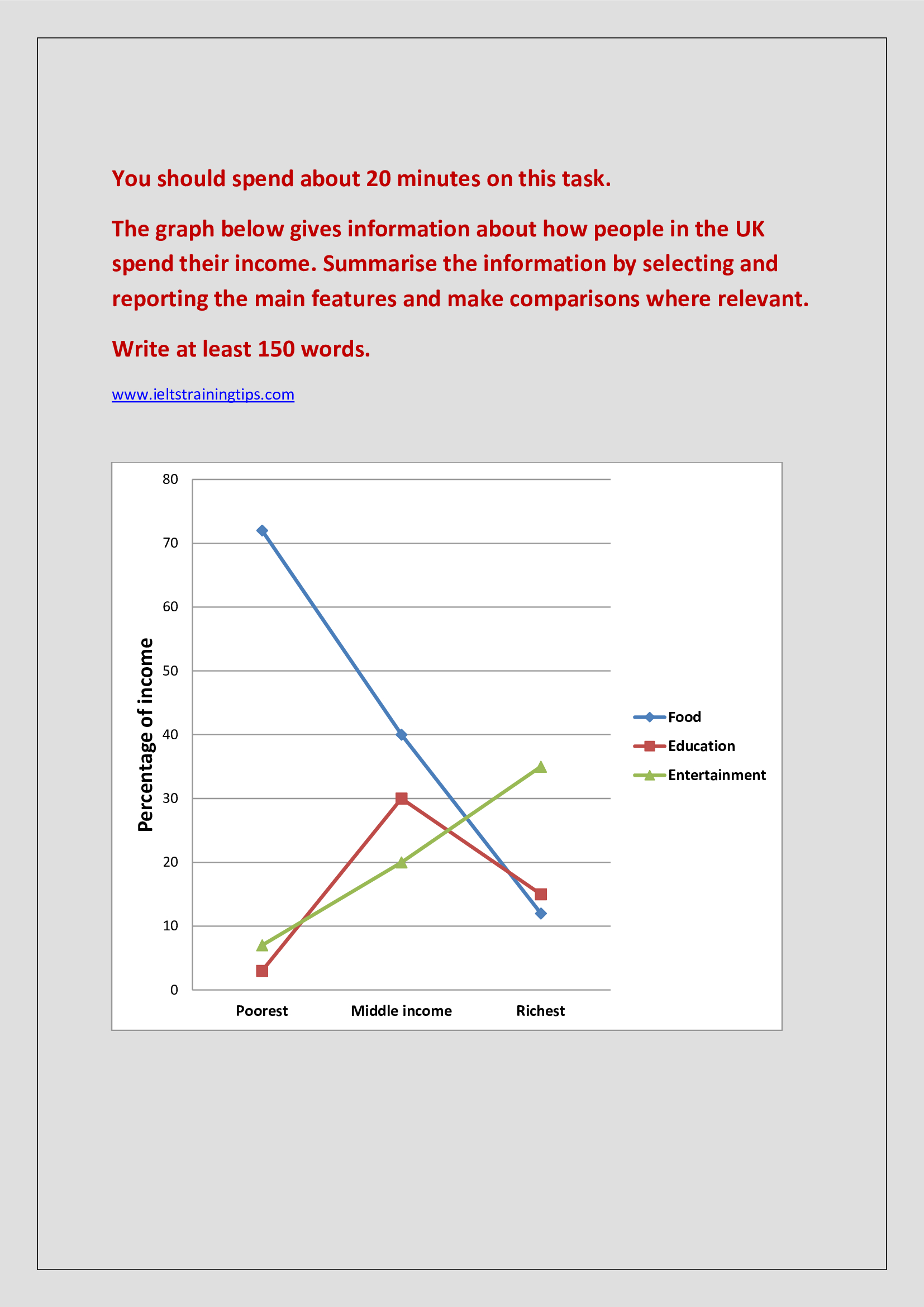
Information on the way in which the residents of the UK spend the income they earn in three specific sectors is portrayed in the given line graph.
Overall, it is clear that the spending habits differed widely according to the level of income earned.
As per the chart, the poorest are seen spending more on food, when compared to education and entertainment. When almost three-fourth of their income is spent on food, the share of money they spend on the other two areas is under 10.
As the income earned increases, the pattern of spending also exhibits tremendous changes. When it comes to the middle class, the priority of spending on education grows momentum instead of food. This group is seen spending 30% of their income in education, just 10 less than on food, and 10 more than on entertainment.
The pattern is seen changing further as the earning grows. In case of the richest, entertainment is seen as more significant than the other two. When they spend over a third of their income on entertainment, spending on food and education range between 12 and 15%.
Word count: 180