


You should spend about 20 minutes on this task.
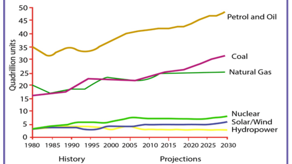
The graph below gives information from a 2008 report about consumption of energy in the USA since 1980 with projections until 2030.
Summarize the information by selecting and reporting the main features and make comparisons where relevant.
Write at least 150 words.
MODEL ANSWER:
A 2008 report on the energy consumption in the USA by fuel from 1980 till now, and its projection till 2030 is picturised in the given line graph.
Overall, it is clear that the fuel consumption from fossil fuels such as petrol and coal had an upper-hand over the others’ and is expected to be the same in future.
As per the chart, in 1980, Americans depended heavily on petrol and oil, and this was approximately 35 quadrillion units. Their next choice was natural gas(20 q units), followed by coal (16 q units). It is also noted that the fuel consumption from other sources (nuclear, solar and hydro-power) was comparatively less, which stood at 4 q units.
The trend is seen almost the same at present, when the petrol consumption hits over 40 q units, while coal and natural gas is seen used moderately at around 25 q units. Compared to the consumption pattern in 1980, the dependence on other sources varies slightly, with nuclear power the most favorite (6 q units) and hydro-power the least (3 q units).
By 2030, energy consumption from fossil fuels that is from petrol and coal is expected to rise further. The use of petrol is anticipated to hit nearly 50 q units, which would be almost 20 q units more than that of coal. While the natural gas consumption would remain at an average level, no change is expected in case of other sources.