You should spend about 20 minutes on this task.
The graph below shows the percentage of dependents in 2000 and the predicted figures in 2050 in five countries, and also gives the world average. Summarise the information by selecting and reporting the main figures and make comparisons where relevant.
Write at least 150 words.
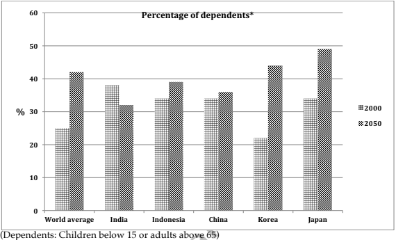
The share of dependents (children below 15 or adults above 65) in the world when compared to the statistics of the same share in five countries in 2000, along with their projections in 2050 are depicted in the given column graph.
In general, the dependent population is expected to increase in all the given countries except in India when compared to the global statistics, which also shows an anticipated growth in its proportion.
As per the chart, out of the global population, 25% were either under 15 or over 65 in 2000. All the countries, except Korea (22%) recorded a higher rate of dependents out of their respective total population when compared to this statistics. While in India, this was 38%, it was 4% less in other three countries (Indonesia, China and Japan).
By 2050, a growth of around 17% is anticipated in the global proportion of dependents. When this is compared to the given countries’ statistics, the most visible change is predicted in Korea, where the rate would climb by around 20%. In Japan the growth expected is by around 16%, to become the country with the most dependents. In China and Indonesia, the growth in the rate would range between two and five. However, in India, the rate is projected to fall by approximately five.