Changes observed in the commuting pattern of office goers in a European city in 2009 when compared to 1959 are elucidated in the given charts.
Overall, it is clear that the average duration and distance of travel increased. It is also seen that except in the share of people depended on train, there were visible variations.
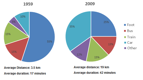
In 1959, most staff went office and came back on foot, and this was more than half of the total (55%). Around 30% of them depended on public transport, with exactly the half by bus, and the other half by train. The share of those who used cars was just a tenth of the total. A mere 5% depended on other available modes.
When the share of employees who depended on train stood the same (15%), there was a slight dip of 2% in the rate of those who commuted by bus in 2009. When there occurred a reduction in the percentage of those who travelled on foot by 30%, the share of those who travelled in automobiles went up by 25%. Those who relied on alternate modes too hiked their share by 7%.
It is to be noted that both the average distance and duration of travel increased between the years. This was by 15.5 km and 25 minutes respectively.