


MODEL ANSWER>>>
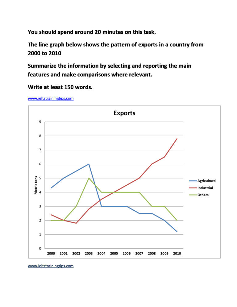
Fluctuations in the pattern of exports in a particular country over a decade from 2000 are drawn in the given line graph.
Overall, it is clear from the graph that despite an overall fluctuating pattern, the growth of exports from industrial sector was exceptional.
In 2000, agricultural exports had a clear upper hand over the other types. When the country recorded approximately 4.3 metric tons of agricultural goods exported in the year, industrial exports and other exports stood behind with around 2.4 and 2 metric tons respectively. The year 2003 was the best for the country in case of its agricultural and other products’ exports (6 and 5 metric tons).
After an initial drop of about 0.5 metric tons in 2002, the industrial exports made a consistent progress in the rest of the period, which became sharper, and eventually hit a peak of about 8 metric tons in 2010.
On the other hand, after 2003, exports from the non-industrial sectors started declining, of which the agricultural sector suffered more loss. By 2010, the agrarian sector could export just only over a metric ton, whereas exports from other sectors recorded exactly 2 metric tons.
Word count: 178