You should spend about 20 minutes on this task.
The line graphs below show the production and demand for steel in million tonnes and the number of workers employed in the steel industry in the UK in 2010.
Summarise the information by selecting and reporting the main features, and make comparisons where relevant.
Write at least 150 words.
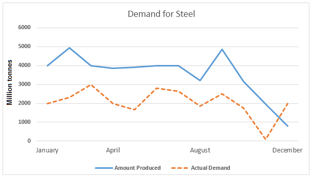
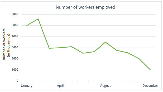
Data regarding production and actual demand of steel, along with the number of workers employed in the same industry in 2010 is depicted in the given line graphs.
In general, the demand of steel and the quantity of its production were somewhat related, whereas the number of employees in the industry saw a decline over the period.
It is obvious that the steel production was generally higher than the actual demand except in December. In January, when the demand was 2 million tonnes, the production was exactly its double. Since then, the production hiked twice to 5 million tonnes, one in February and the other in September.
The two months in which the demand dropped noticeably between these two points were in May and in August (less than 2000 million tonnes), while the highest demand was in March (3000 million tonnes). Both the demand and production began to plunge since September. By December, the production fell to less than 1000 million tonnes, whereas by November, steel was almost nil demanded. However, the demand surpassed the production then after.
The number of workers employed in January in the industry was 5 million. Despite a hike of 0.5 million in the next month, the number of employees fell gradually to just one million in December.