You should spend about 20 minutes on this task.
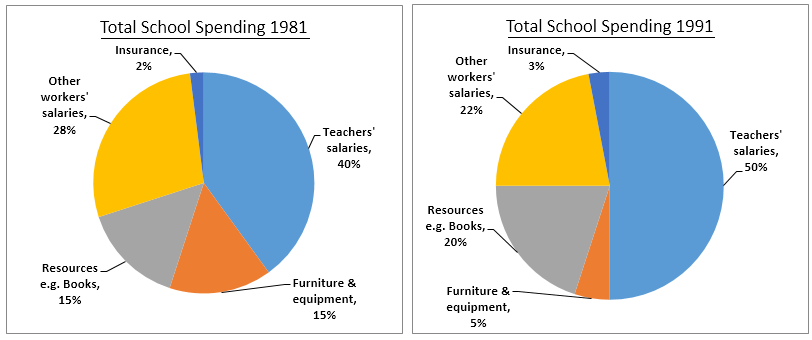
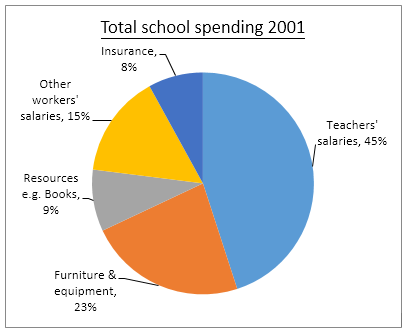
The three pie charts below show the changes in annual spending by a particular UK school in 1981, 1991 and 2001.
Summarise the information by selecting and reporting the main features, and make comparisons where relevant. Write at least 150 words.
The way in which the annual spending by a particular UK school changed in 1991 and 2001, when compared to its own spending in 1981 is depicted in the given pie charts.
Overall, it is clear that except in case of the salary of teachers, there were clear fluctuations in the school’s spending.
As per the charts, the lion’s share of the school’s expenditure was allocated for remunerating its staffs. Of this, the major share was teacher’s salary. This accounted for 45% in 2001, which was 5% more than of 1981 and 5% less than that of 1991. The remaining share was spent to distribute salaries to other workers. However, their share of salary fell gradually from 28% in 1981 to 15% in 2001.
The next major share of spending went to resources, furniture and equipment. In case of furniture and equipment, the fund allocation fluctuated between 5% and 23%, whereas in case of resources (books), the fluctuation was between 9% and 20%. The only exception was in case of insurance when there was an increase of spending share from 2% in 1981 to 8% in 2001.
Word count: 166