MODEL ANSWER:
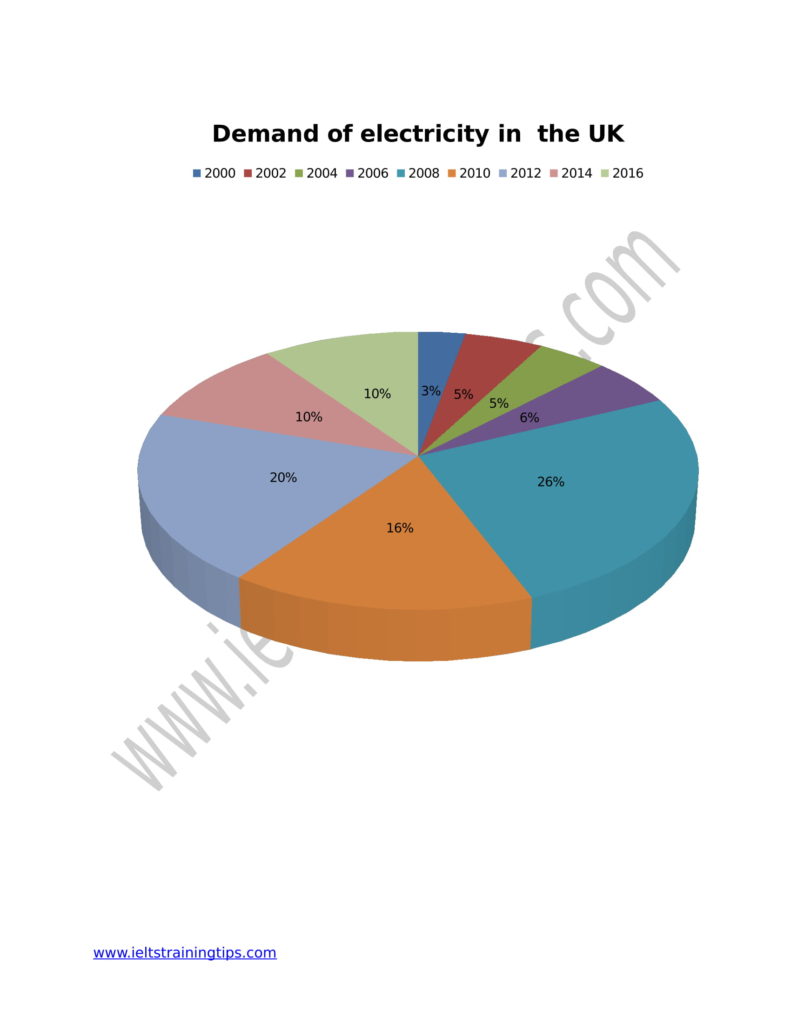
The fluctuations in the demand for electricity in the UK every two years from 2000 to 2016 are portrayed in the given pie chart.
As can be visible in the chart, the demand for electricity in the UK was higher between 2008 and 2012. In 2008, this was just over a quarter, whereas in 2010, it slipped to nearly a sixth before climbing to 20% in 2012. The following figures shows a consistent demand, where it got stagnated at 10% in both 2014 and 2016. The average electricity demand of the people of the UK over this period (2008 to 2016) was nearly 17%.
Between 2000 and 2006, though the demand was nominal, the trend was increasing. This ranged from three to six. Only a mere 3% of the total population in the UK demanded electricity in 2000, whereas the figure rose to 5% after a couple of years. A phase of demand stability followed till 2004, and by 2006, it climbed to 6%. The average electricity demand of the residents of the UK during this period (2000 to 2006) was nearly 5%.
Overall, it is clear from the chart that the demand for electricity in the UK was comparatively high towards the middle of the given period.