


You should spend about 20 minutes on this task.
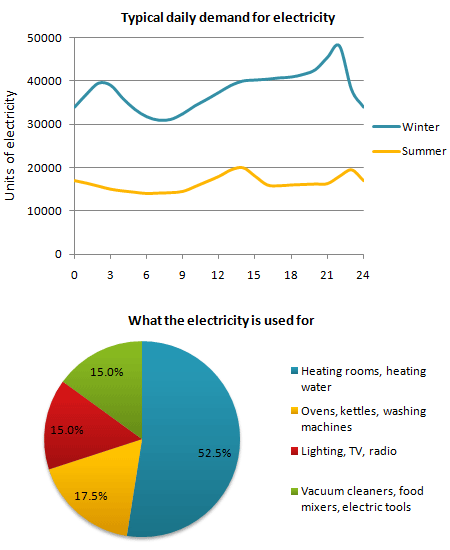
The graph below shows the demand for electricity in England during typical days in winter and summer. The pie chart shows how electricity is used in an average English home.
Summarise the information by selecting and reporting the main features, and make comparisons where relevant.
Write at least 150 words.
MODEL ANSWER>>>
The consumption pattern of electricity, based on the units consumed in two seasons: winter and summer in England and the share of its overall consumption in a typical English home are depicted in the given charts.
Overall, it is clear that higher daily demand for electricity is seen in winter and the lion’s share of consumption goes for heating rooms and water.
The typical daily demand of electricity in England is generally more in winter than in summer and it remains almost the double throughout a day. In winter, between 12 am and 2 pm, the demand fluctuates between 30,000 and 40,000 units. However, it rises and reaches nearly 48,000 units by 9pm. Then after it declines to around 34,000 units by midnight. The seasonal daily demand in summer is the maximum only twice a day: 2 pm and 11 pm (20,000 units) and does not cross 20,000 units.
Heating is the area where an average English household uses most of its electricity for. This accounts for just over a half of the total consumption (52.5%). Electrical gadgets including ovens, kettles and washing machine consume just over a sixth of the total, whereas the consumption from all other means accounts for about 30%.
Word count: 191