You should spend about 20 minutes on this task.
The graph shows the spending on education, medical care and pension in a particular country from 2001 to 2051. Summarise the information by selecting and reporting the main features and make comparisons where relevant.
Write at least 150 words.
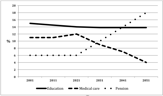
The expenditure of a country on three different areas: education, medical care and pension from 2001 till now, and its prediction till 2051 are depicted in the given line graph.
Overall, it is clear that the trends are expected to change tremendously in the latter half of the period.
As per the chart, of the three, the country spent the most on education till now (2021), and this was around 14 to 15% of its total spending. The next major area which it expended the most was on the field of medical care, and this ranged from 11 to 12% of the total. The least share of disbursement was in the pension sector, and this accounted for just 6%.
It is to be noted that when the spending on education is expected to remain constant, the pattern of expenditure on the other two sectors are predicted to be almost reciprocal. By 2031, both sectors are projected to receive equal funding from the government (over 9%). From this point, the liability of the country in giving pension is anticipated to grow to 18%, whereas the healthcare expense would fall to just 4% of the gross spending.