You should spend about 20 minutes on this task.
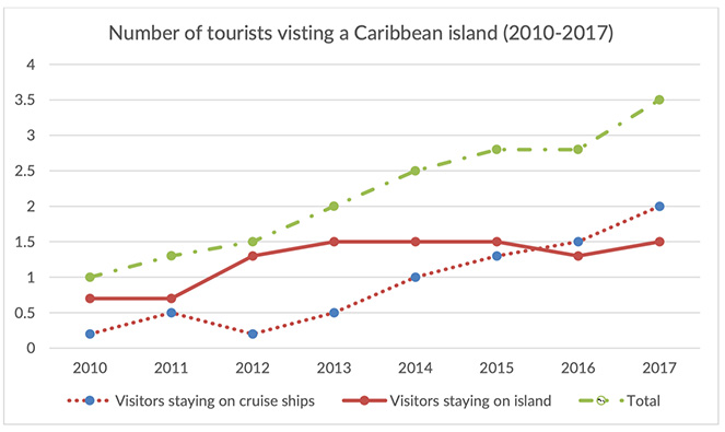
The graph below shows the number of tourists visiting a particular Caribbean island between 2010 and 2017.
Summarize the information by selecting and reporting the main features, and make comparisons where relevant.
Write at least 150 words.
FOR VIDEO EXPLANATION: https://youtu.be/Rb24ExY7FpM
The changes in the pattern of visit to a Caribbean island between 2010 and 2017 are depicted in the given line graph.
Overall, there was an increase in the aggregate number of visitors to the island over the period, despite some fluctuations in between.
As per the chart, of the total one million visitors, most preferred to stay on the island in 2010. When around 800,000 preferred to visit the island, the rest stayed on cruise ships. Despite an increase of about 250,000 cruise ship visitors in 2011, the number fell back to the same as in 2010. On the other hand, there were around 1.3 million island visitors in 2012.
A converging pattern is seen in the number of visits since 2012, until the middle of 2015, when both types of visits recorded 1.4 million visitors. Then after, the attendance to the cruise ships increased steadily to hit an all-time-high of 2 million in 2017, which was 500,000 more than the number of tourists to the island.
Word count: 153