


You should spend around 20 minutes on this task.
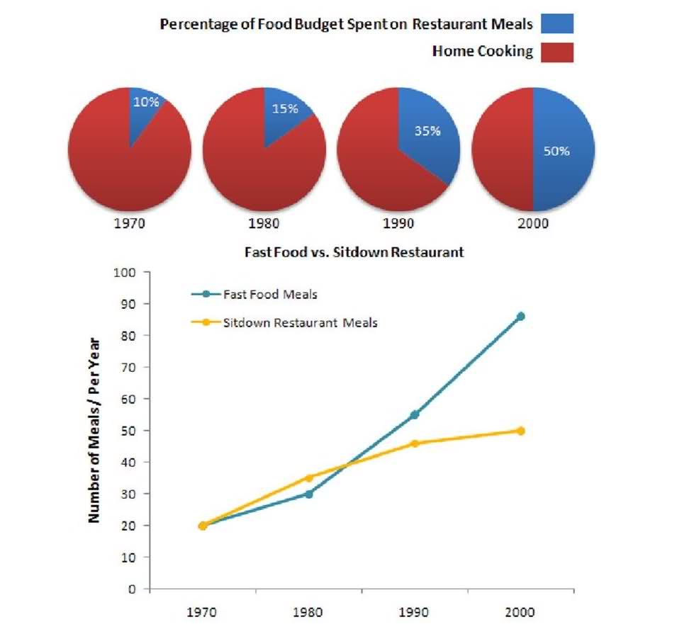
The charts below show the percentage of their food budget the average family spent on restaurant meals in different years and the graph shows the number of meals eaten in fast food restaurants and sit-down restaurants.
Write at least 150 words.
MODEL ANSWER:
The expenditure percentage on the food by an average family and the typical number of meals eaten in both fast- food and sit-down restaurants between 1970 and 2000 are elucidated in the given chart.
As per the pie chart, it is clear that the preference for home cooking is seen declining over the three decades from 1970. In 1970, the spending share on restaurant meals was just a tenth, and after a decade, this rose by 5%. However, the latter years (1990 and 2000) saw a considerable surge in this rate: 25 and 40% respectively.
Turning to the information on the number of meals per year, except from 1970 to 1980, fast food meals were the most preferred and it had an exceptional upper hand over the sit-down restaurant meals by 2000. In 1970, both the fast food and sit-down meals were around 20 in number. However, by 2000, the number of fast-food meals went up to over 80, whereas, the others’ number was around 30 less.
Overall, it is clear,there was an increasing preference towards the restaurant meals, especially the fast food meals over the period.
Word count:170