MODEL ANSWER:
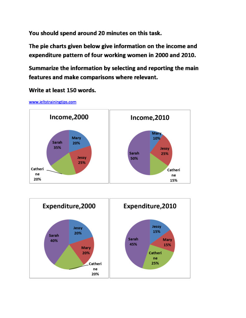
The distribution of the proportion of income earned by four working women and their rate of expenditure from their individual earnings in the year 2000 and 2010 are portrayed in the given pie charts.
As is shown by the charts, in both earning money and it’s disbursement, Sarah stood first among the four in both the years. Out of the total income earned, more than a third (35%) was Sarah ‘s in 2000, which became exactly the half of the same in 2010. From this, she expended approximately 40% in the year 2000, which rose by 5% in 2010. In both the years, Jessy earned a quarter of the total income. She, however spent 5% less in 2000, when compared to her rate of spending in 2000.
Mary ‘s and Catherine ‘s earnings went down by 10 and 5% respectively in the latter year. When Mary had her expenditure pattern much similar to Jessy’s, Catherine ‘s was very similar to Sarah’s.
Overall, it is clear that an even fluctuation is seen between the income and expenditure pattern of these women and the proportion of fluctuation was exactly the same for all between the years.
Word count:180