


MODEL ANSWER:
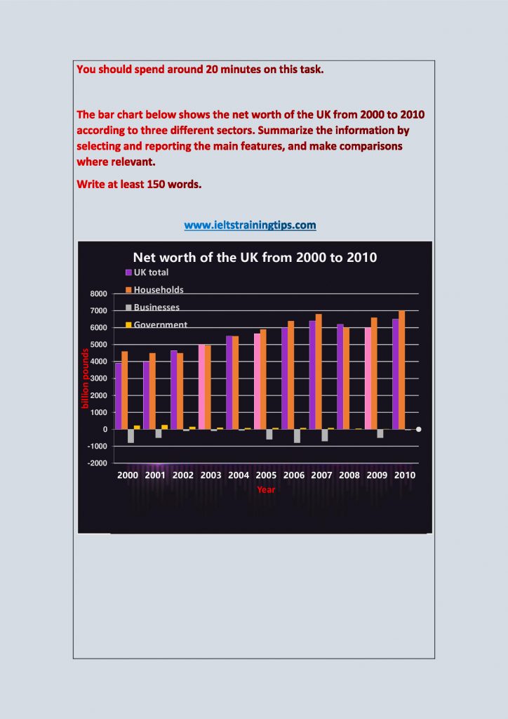
The bar chart projects the fluctuation in the aggregate wealth of the UK divided by three different sectors between 2000 and 2010.
In general, the total wealth of the UK followed an upward trend in the given period, while the trend was opposite in case of the business sector.
The figures of the UK households stood fairly steady between 2000 and 2002 then began to surge. From 4500 billion pounds, it grew to just under 7000 billion by 2007. Over this period, the gross wealth of the UK too showed positive figures (3900 billion to 6500 billion pounds). However, the growth of the governmental wealth during this time was minimal (from about 100 to 300 billion).
While both the household and government net wealth shrunk significantly in 2008, the latter’s net worth fell so much that it actually went into negative figures in 2010. The trend was similar in case of the total net worth of the UK.
Although the net worth of business in the country improved between 2000 and 2002, the trend lived short and began to worsen again only a year later. By 2006, it returned to the levels of 2000. The best year for this sector was in 2008, where it hardly showed a negative figure.
Word count: 192