You should spend about 20 minutes on this task.
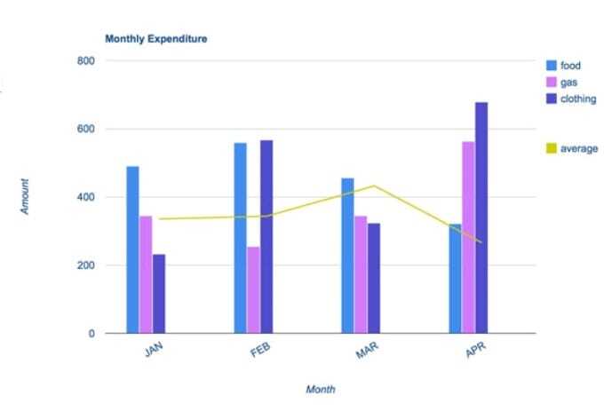
The bar chart shows the monthly spending in dollars of a family in the USA on three items in 2010.
Summarise the information by selecting and reporting the main features, and make comparisons where relevant.
Write at least 150 words.
The average monthly expenditure of an American family along with specific expenses on food, gas and clothing in the first four months of 2010 is depicted in the given chart.
Overall, it is seen that the average spending stood irregular during this period, with Americans spending more on food and clothing than on gas.
As per the chart, during the first three months, the expenditure on food was comparatively high than the last month’s spending. This ranged from $450 to $550, with February the month, they spent the most. However, the amount expended declined in April, which hit the lowest mark of just over $350.
Disbursement on clothing was seen higher in February and April which accounted for around $580 and $700 respectively. In both months, this was the highest spending in the list, however in the other two months the expenditure on this was the least.
Despite a fall between the first two months (from approximately $330 to $230), the amount which was spent on gas rose to nearly $570, surpassing the amount which was spent on food.
The average spending fluctuated over the period, and the highest recorded(over $400) was in March.
Word count: 184