


You should spend about 20 minutes on this task.
The chart and graph below give information about participants who have entered the Olympics since it began.
Summarize the information by selecting and reporting the main features and make comparisons where relevant.
Write at least 150 words.
MODEL ANSWER>>>
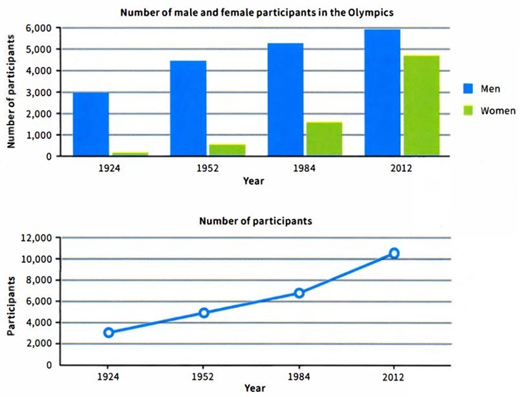
Statistical information regarding the number of participants in Olympics divided by genders along with their aggregate numbers since it began is depicted in the given charts.
Overall, it is clear that the participation is seen climbing among both genders, with an unprecedented growth rate among women towards the second part of the period given.
As per the first chart, male participation is seen more in the game all through the period since the game began. This grew from just 3,000 in 1924 to almost 6,000 in 2012. Between these years, in 1954 it was about 4,400 and in 1984, it was approximately 5,200.
On the other hand, the number of females participated remained well below their counterparts’ number till 1984. However, their participation increased from just under 100 in 1924 to about 1,600 in 1984. There occurred a remarkable growth in their number after this year, to reach approximately 4,700 in 2012.
Considering the gross participation, the growth between 1924 and 2012 was from just over 3,000 to approximately 10,300.
Word count: 151