


You should spend about 20 minutes on this task.
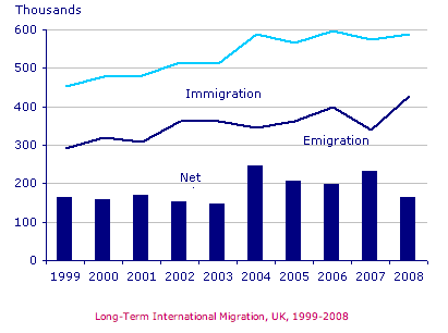
The chart below gives information about UK immigration, emigration and net migration between 1999 and 2008.
Summarize the information by selecting and reporting the main features, and make comparisons where relevant.
You should write at least 150 words.
MODEL ANSWER>>>
Data regarding the UK immigration and emigration, along with net migration from 1999 to 2008 is depicted in the given chart.
Overall, both immigration and emigration rates rose over the period, with the figures for immigration significantly higher.
As per the chart, in 1999, the number of immigrants accounted for around 450,000, which was about 170,000 higher than the number of emigrants. The figures of both these groups exhibited a gradual rise to just above 500,000 and 350,000 respectively in 2003, with a small dip in the year 2001.
It is interesting to see a wider disparity between both the immigration and emigration numbers in 2004. When the former figure hit a peak of nearly 0.6 million, the net difference hit the highest (250,000).
Fluctuations are seen in these figures after 2004, till the end of the period. The year 2006 saw a higher number of both immigrants and emigrants, when the former figure hit an all time high of 0.6 million, whereas the latter was recorded at 0.4 million.
The net difference between both the immigrant and emigrant numbers rose again in 2007 to 230,000. By 2008, the figures of immigrants and emigrants settled at 590,000 and 430,000 respectively.
Word count: 180