You should spend about 20 minutes on this task.
The chart below shows the percentage of adults of different age groups in the UK who used the Internet every day from 2003 to 2006. Summarize the information by selecting and reporting the main features and make comparisons where relevant.
Write at least 150 words.
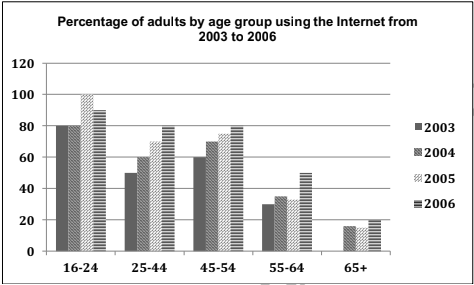
The pattern of daily internet usage in the UK divided by age groups between 2003 and 2006 is depicted in the given bar graph.
In general, there was an increase in the rate of users in all age groups, and the most users were from the youngest group.
As per the chart, the rate of those who used internet had not fallen below 80 in case of the age group between 16 and 24 in all the four years. In 2005, the rate rose to 100, but in the next year, it fell by 10. The pattern of everyday internet usage was similar in both 25-44 and 45-54 age groups. When the proportion of users from the younger group (25-44) climbed to 80 in 2006 from just 50 in 2003, the percentage of the older group touched the 80 mark in 2006 from 60.
Compared to their younger counterparts, there were less internet users among those who were over 55. Between 55 and 64, except in 2006, the rate of users ranged from 30 to 35. In 2006, this rate grew to nearly 50. However, the rate had not even crossed 20 in case of the oldest till 2006.
Word count: 171