You should spend about 20 minutes on this task.
The chart below shows the way in which three age groups of people in the UK were exposed to various devices in 2020.
Summarize the information by selecting and reporting the main features and make comparisons where relevant.
Write at least 150 words.
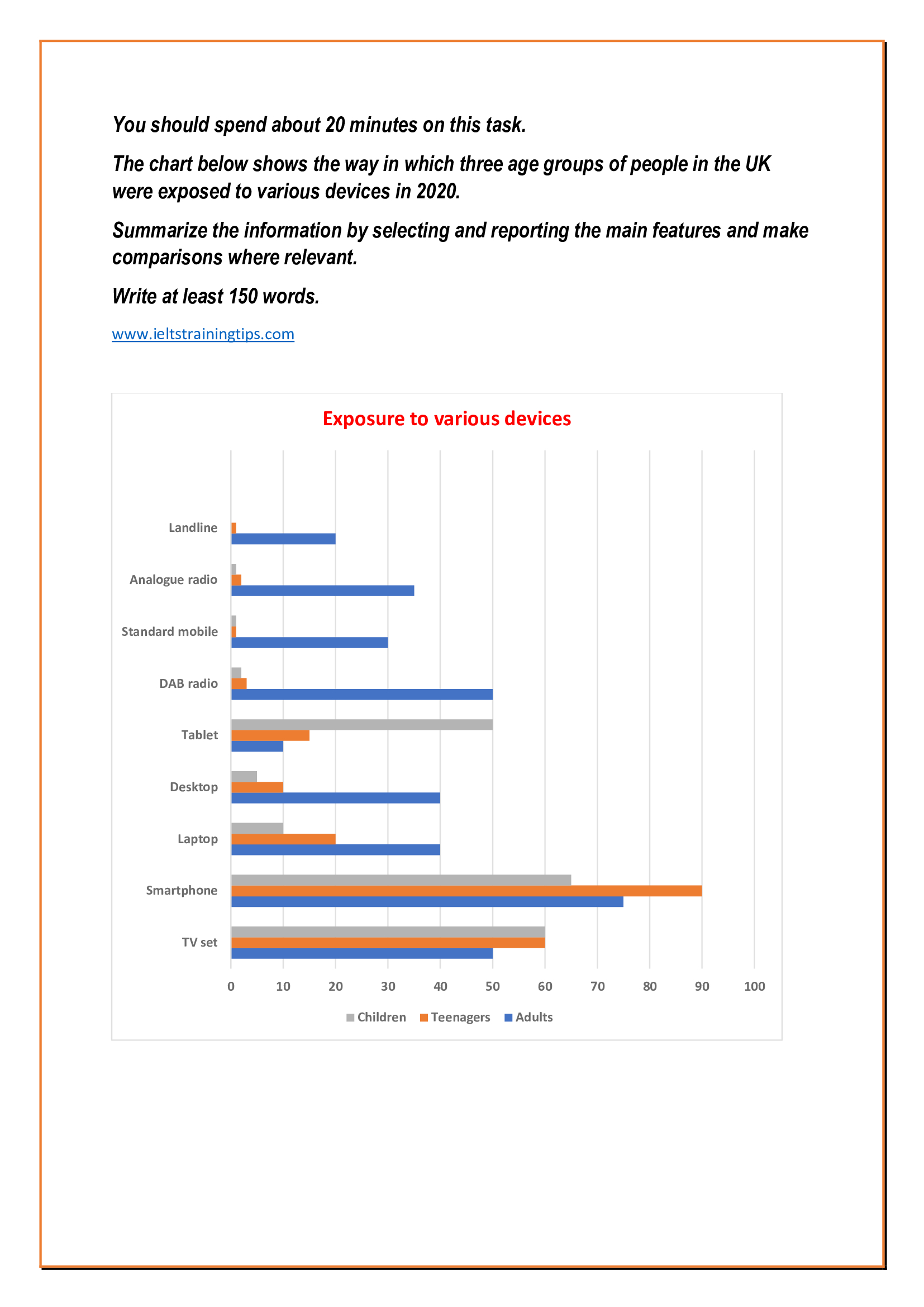
The popularity of nine different technological devices in the UK in 2020, divided among three different age groups is depicted in the given chart.
Overall, it is clear that smartphones were the most popular in the year irrespective of the age groups.
Of the most popular devices, the first two preferences were smartphones and television sets. In 2020, almost 90% of the adolescents used a smartphone, 15% more than the rate of adults and 25% more than the rate of children. In case of TV sets, the rate of child and adolescent viewers was 60, 10 more than the adults.
Around two-fifth of the adults had access to laptops and desktops, while their younger age groups were less-interested in those gadgets, and the proportions ranged between 5 and 20. It is interesting to note that 50% of the UK’s children used a tablet in 2020, far higher than the rates of their older age groups (15 and 10% respectively).
The four least-popular devices among children and teenagers were landline, standard mobile, analogue radio and DAB radio. When the popularity of these gadgets ranged between 20 and 50 among adults, only one to three per cent of the younger age groups used it.
Word count: 187
Expected band score: 6.5