You should spend about 20 minutes on this task.
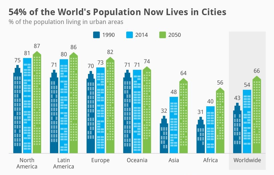
The chart shows changes in the urban population in six different regions of the world in 1990, 2014 and 2050.
Summarize the information by selecting and reporting the main features and make comparisons where relevant.
Write at least 150 words.
Information regarding the urban population of the world when compared to six specific regions between 1990 and 2014 and its projection in 2050 is depicted in the given chart.
Overall, it is clear that the global urban population exhibits a growing trend, which is directly proportional to the growth in six different regions.
As per the chart,the proportion of total world population was nearly half of the total in both 1990 and in 2014 , and this was 43%and 54% respectively. By 2050, this is expected to grow further and would hit 66%.
The urban population in North America,Latin America,Europe and Oceania was far higher when compared to African and Asian regions’ in 1990 and in 2014.. In 1990,75% of the North American population lived in cities,while the average urban population in Latin America,Europe and Oceania accounted for an average of 70%.By 2014, city-dwellers in North America grew by 6%, whilst in Latin America and Europe,the growth rates were 9% and 3%. The city population of all this three regions is expected to be beyond 80% in 2050, whereas in Oceania, the least growth is expected, and that is 3% from 71%.
The most significant swelling in the urban population is seen in Asia and Africa. From 31% and 32% in 1990, it is expected to skyrocket to 64 and 56% by 2050.
Word count: 198
Image source: The United Nations (for educational purpose)