


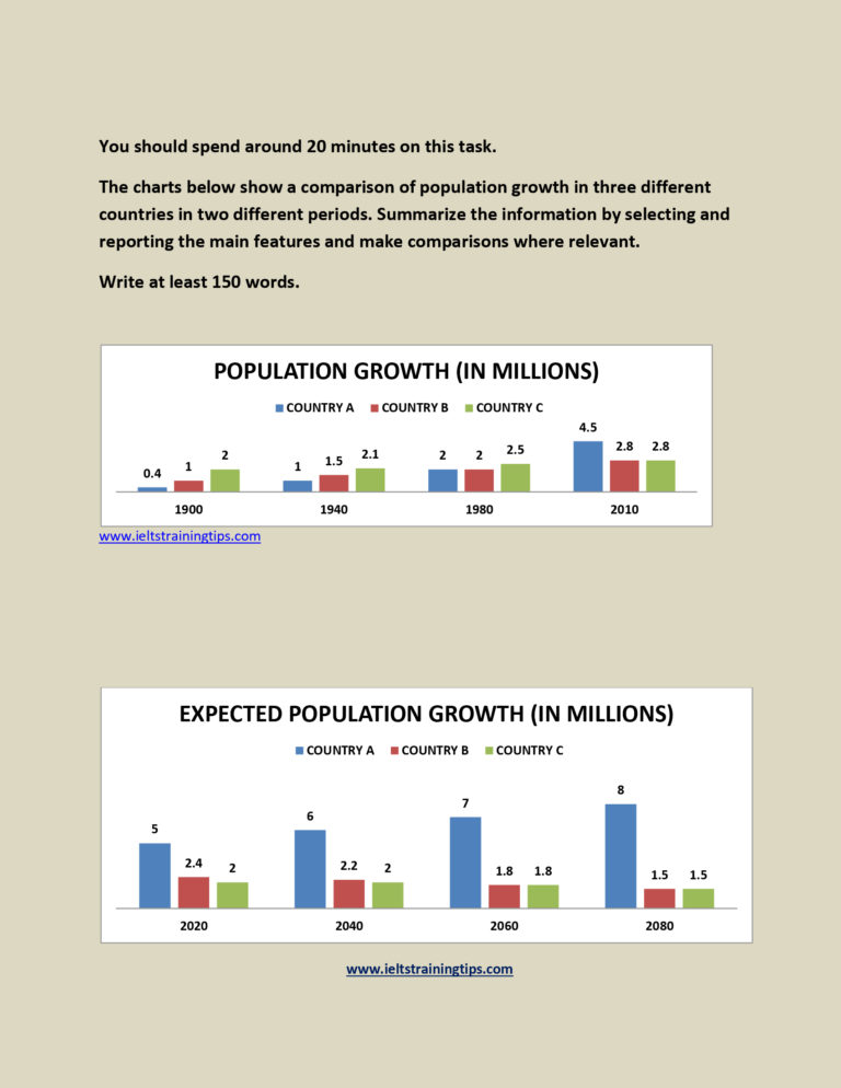
An illustration of population growth in three distinct countries with its projections divided by two time frames is depicted in the given bar charts.
Overall, it is clear that the population in these countries inclined throughout the first time frame, but is expected to decline in future, except in country A, which projects a steady positive growth.
It is apparent from the first chart; there was a considerable growth in number of people in all the three countries. In 1900, country C had the highest population, at 2 million, which was double than country B and four-fold higher than country A. Between 1940 and 1980, the population growth in all the countries ranged between one and 2.5 million, with country C at the top. However, in 2010, the demographic statistics of country A hit a record high of 4.5 million, surpassing the other two (2.8 million each).
Turning to the second graph, in country A, the population is expected to rise steadily to 8 Million in 2080 from 5 million, the last recorded population in 2020. By contrast, other two countries anticipate a decline from an average 2.2 million to 1.5 million between these years.
Word count: 181