


You should spend about 20 minutes on this task.
The charts below show household spending patterns in two countries between 1980 and 2008.
Summarize the information by selecting and reporting the main features and make comparisons where relevant.
You should write at least 150 words.
MODEL ANSWER>>>
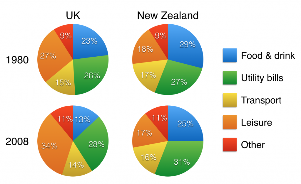
The proportion household expenditure in the UK and New Zealand in 1980 and 2008 is compared in the given pie charts.
Overall, despite fluctuations in the spending patterns, people of the UK preferred leisure the most.
As per the charts, in both 1980 and 2008, the highest household spending in the UK was on leisure, and this was 27 and 34% respectively. When this expense was most on food and drinks (29%) in New Zealand in 1980, in 2008 it changed to utility bills (31%).
In 1980, the spending pattern of both countries was similar in case of utility bills. In the UK, it was 26%, while in New Zealand; it was a per cent higher. The expending on food and drinks was less in the UK at 23%, while the Kiwis spent 6% more on this. In the sector of transport too, the disbursement rate was higher in the New Zealand (17% compared to 15%).
In 2008, the second highest expenditure was on utility bills in both countries (28% and 31%). When 14% of the total expense of the UK citizens was on transport, it was 2% higher in New Zealand. Spending on food and drinks in the New Zealand accounted for a quarter of their total household expenditure, which was almost double than that of the UK. The share of expending on others stood the least in both the countries in both years.