


You should spend about 20 minutes on this task.
The charts below show the proportion of the energy produced from different sources in a country between 1985 and 2003. Summarize the information by selecting and reporting the main features, and make comparisons where relevant.
Write at least 150 words.
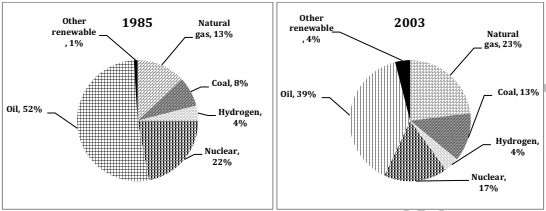
The pie charts depict the pattern of energy generation from various sources in a country in 1985 and how it changed in 2003.
Overall, when the use of oil and nuclear energy was cut down, energy generation from natural gas, coal and other renewable sources increased.
In 1985, the country depended heavily on oil resources for energy production. This was just over a half of the total energy generated in the country (52%). Around 22% of the energy was generated from nuclear power plants. Natural gas was used to generate 13% of energy, while the rate of energy produced from coal and hydrogen was 8% and 4% respectively. The rest one per cent was from other renewable sources.
In 2003, there was a 13% decline in the energy produced from oil compared to that in 1985. Similarly, there was a 5% decline in the power generated from nuclear sources. While the proportion of energy the country received from hydrogen sources remained the same, the rate of energy generated from natural gas, coal and other renewable sources climbed substantially. This was by 10%, 5% and 3% respectively.