


You should spend about 20 minutes on this task.
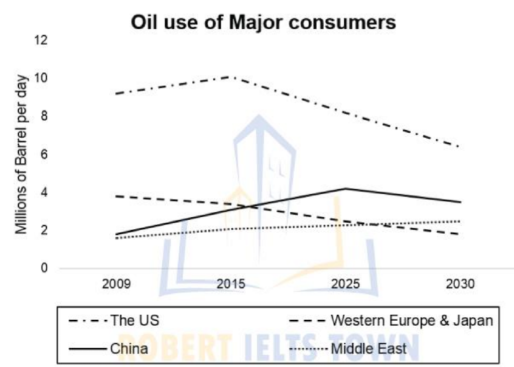
The graph below gives information about total oil use of 4 main consumers from 2009 to 2030.
Summarize the information by selecting and reporting the main features, and make comparisons where relevant.
You should write at least 150 words.
MODEL ANSWER>>>
Information regarding the gross consumption pattern of four major global oil consumers from 2009 till now and its projection till 2030 are depicted in the given graph.
At a glance, it is clear that though there were fluctuations in the overall consumption, a general decline in predicted in future.
As per the chart, the USA remained the topmost consumer since 2009 and is projected to retain this position till 2030. In 2009, it used about 9 million barrels, which was more than double than that of the consumption of Western Europe and Japan (4 million barrels). At this point of time, China and the Middle East consumed just 2 million barrels.
After a steady incline to 10 million barrels in 2015, which was the highest, the oil use in the US started shrinking, and is anticipated to settle at 6 million barrels by 2030. The consumption in China too grew, and is projected to hit the maximum of 4 million barrels by 2025. However, it is set to fall by a million by 2030.
When the oil consumption pattern in Western Europe and Japan exhibited a steady slip, and would settle under 2 million barrels, the consumption pattern in the Middle East is seen almost stationary at 2 million barrels over the period.
Word count: 196