


You should spend about 20 minutes on this task.
The graph below shows how elderly people in the United States spent their free time between 1980 and 2010.
Summarise the information by selecting and reporting the main features, and make comparisons where relevant.
Write at least 150 words.
MODEL ANSWER:
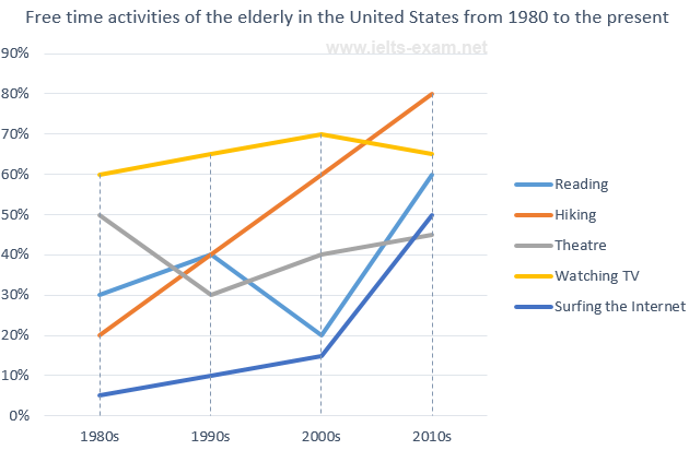
Information about the proportion of old age population who were engaged in different kinds of free-time activities from 1980s till 2010 is illustrated in the given line graph.
Overall, it is evident that except in case of theatre, there was an increase in the participation of elderly population in these activities.
The most notable increase of involvement is seen in hiking, and this was from around 20% to a peak of 80% by 2010. In case of surfing, this was just 5% in 1980, whereas it exhibited a uniform incline to 15% by 2000. However, it showed more than a three- fold increase in the next decade, to hit 50% in 2010.
Though there were some serious fluctuations in between, the rate of those who read over this period doubled from just 30 in 1980. Despite an arrest in the growth rate of those who were involved in watching TV after 2000, it remained the most popular free-time activity among this group almost till the end of the period, and this did not fall below 60.
The only exception is seen in the theatre, when a decline in the share is noted, and this was by 5% between the years (50%-45%).
Word count: 185