You should spend about 20 minutes on this task.
The graph below shows how people buy music. Summarise the information by selecting and reporting the main features, and make comparisons where relevant.
Write at least 150 words.


You should spend about 20 minutes on this task.
The graph below shows how people buy music. Summarise the information by selecting and reporting the main features, and make comparisons where relevant.
Write at least 150 words.
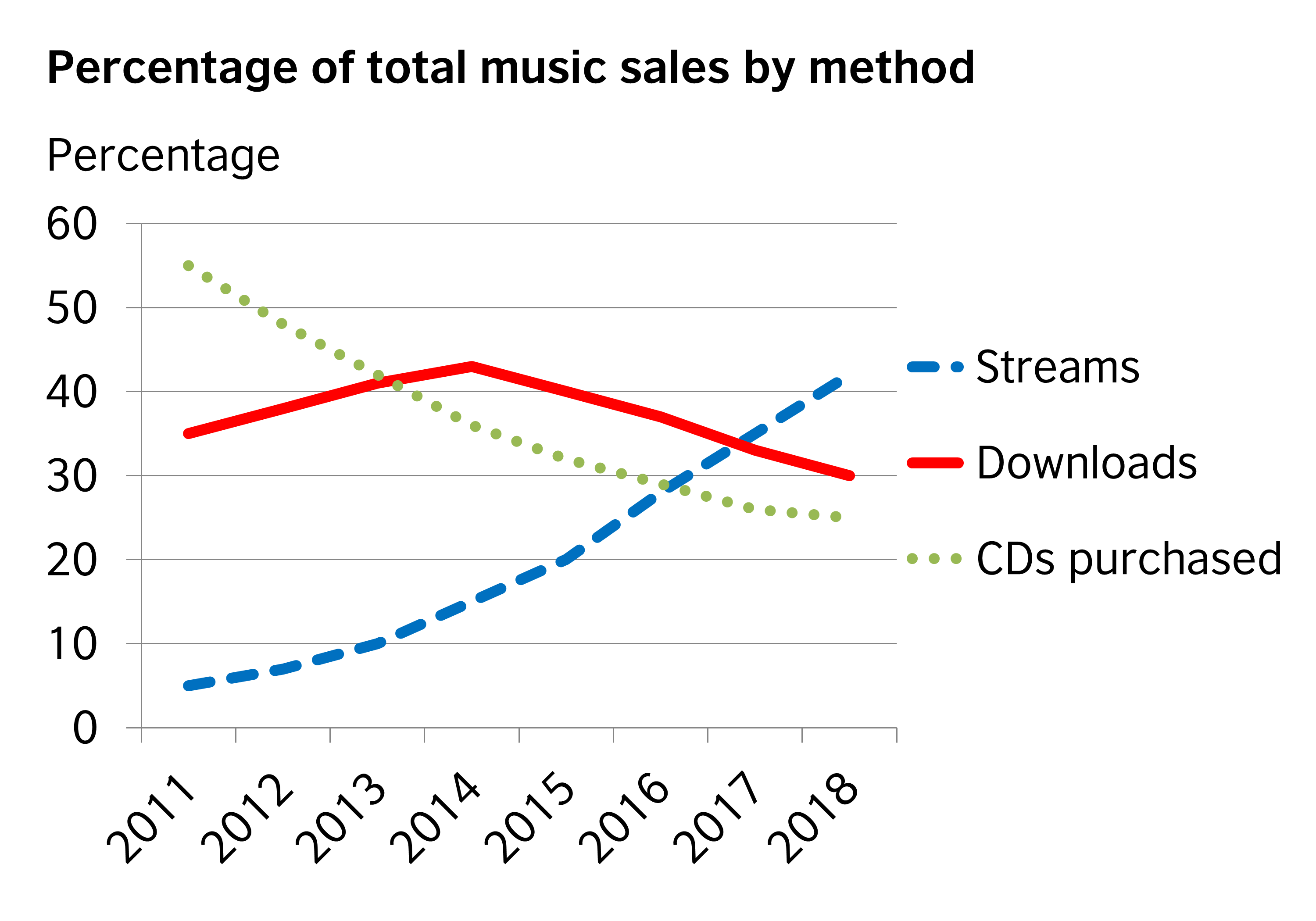
The changes which happened in the trend of music purchase between 2011 and 2018 are portrayed in the given line graph.
Overall, it is clear that the pattern of purchase underwent notable changes, when people started showing an increased preference to the modern trend: ‘streaming’, than the others.
As per the graph, in 2011, CDs were the most purchased, and this accounted for over 55% of the total music sales. Almost 20% less sales is seen in case of downloads in this year, whereas the least purchase was for streams (5%).
When the popularity of CDs slipped at a constant rate between the years to hit nearly 25% of the gross music sales, streams purchase exhibited an opposite trend. During this period, its purchase climbed, crossing the other two (CDs and downloads in 2016 and 2017), to record a maximum share of 40% by 2018.
It is noted that downloads lost over 10% of its market in the later part of the period, despite growing to the most sold method in 2014 with over 40% of purchase.
Word count: 164